Author Archives: Alan@HolisticSofa

Visualizing State & Local Taxation Levels by Income with D3

I am writing this post for two reasons, the first of which has nothing to do with taxation, and the second of which has nothing to do with visualization.  Like peanut butter and chocolate however, they do go well together.

My first reason for this post was to play with the D3.js toolkit for constructing an interactive, animated visualization with real world data; and then see how nicely it would embed in a wordpress post like this one.  I have to say that the more I use D3 the more impressed I am.  There’s a bit of an adjustment to make if you are used to a more procedural approach to defining graphics (such as QuickDraw or OpenGL), however the data joins and enter/append/exit methods for managing changing data are rather elegant.  D3 is certainly another nail in the coffin for Flash, not requiring any client-side install.  I look forward to seeing the development of the new authoring tools and libraries that are being built on top of D3.

My second reason for doing this post was to see what the distribution of state and local taxes is across states for different income groups.  This data is from the Census Bureau 2008, and is estimated for a family of 4 living in the largest urban center of each state.  The taxes included are not just income and property taxes, but also things like vehicle registration and other taxes.  What is expected but still striking to see about these data is  how consistently higher the taxes are on the upper eastern seaboard at all income levels.  In addition, the view clearly shows how lower incomes pay a larger share of income towards these local taxes, as they are not all tied to income level.  These data to not factor in federal taxes, however given that most state and local taxes are deductible on the federal tax return, you can see how the federal tax code is in effect is creating a subsidy for the higher taxation states and lower income individuals, relative to the states with lower taxation levels and higher incomes respectively.

A Gem of an App for Visual Thinkers

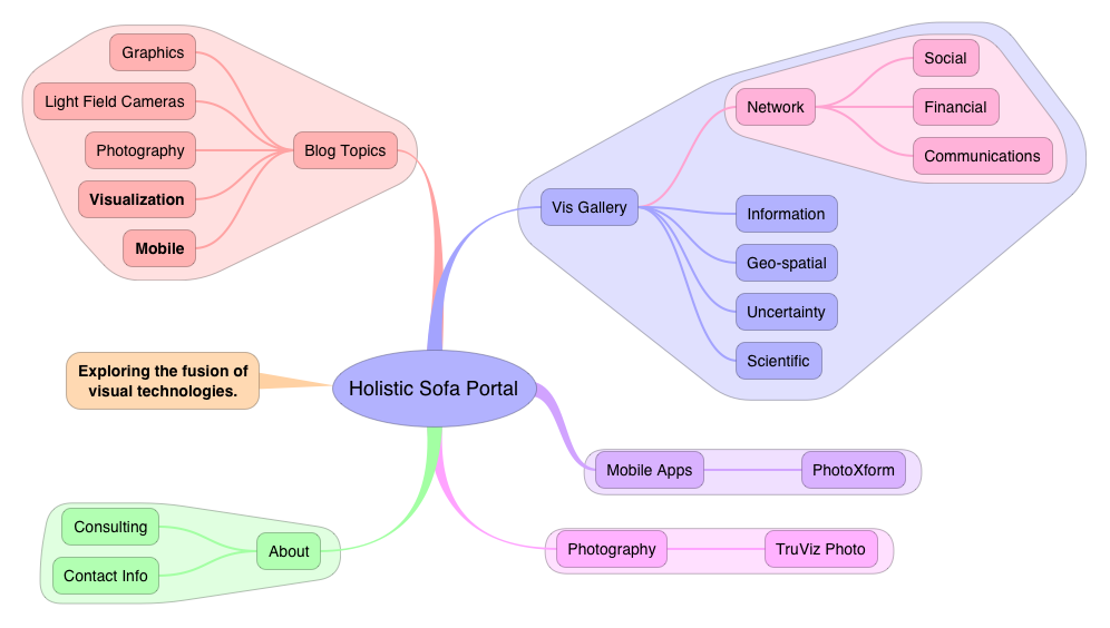
I don’t often get the urge to write product reviews, and you will rarely see them on this site.  However I have recently encountered a fantastic iPad app for mind mapping that has made its way into my everyday workflow and which deserves a shout out from the Sofa.  iThoughtsHD is a mind mapping app for the iPad.  Not quite a visualization tool per-se, more of a diagramming tool.  However the ease with which it can quickly and fluidly generate complex hierarchical (and to some degree cyclical) information allows you to build up fairly sophisticated visual structures with a clean layout and appealing aesthetics.

iThoughtsHD View of Holistic Sofa Website

iThoughtsHD View of Holistic Sofa Website

I have always been a highly visual thinker, using my visual channels to expand my short term mental storage so that I can work with larger and more complex sets of facts and relations at one time.  The whiteboard was my old-school method for thinking visually, however there are many limitations with that method such as inability to save and interact with different whiteboard states, or difficulty in rearranging elements on the board.  Quite a few years ago I tried my first mind mapping software, a program called DevonThink for the Macintosh.  At the time I got the impression that the technology was not quite ready for me yet.  Although powerful, I found the interface cumbersome and the visual expressiveness limited.  I gave up on the whole mind mapping thing at that point, and instead switched to lists to organize my thoughts and plans.  Lots and lots of lists with a variety of software packages.  Currently my main list makers are OmniFocus (iPhone, iPad, Mac) for managing hierarchical todo lists and projects, OmniOutliner (Mac) for detailed projects and CarbonFin Outliner (iPad) for note taking on the go.  These products are all highly capable, and in some cases indispensable, however they’ve also left me wanting more for general brainstorming and rapid thought construction.  While looking around in the App store for alternatives I came across iThoughtsHD and gave it a try.

The example screens in the App Store were pretty slick looking, I was initially a bit skeptical, thinking that this was going to be just another pretty interface.  Putting the app through the paces however, I discovered that the interface is nicely thought out with a minimum amount of touches, menus and palettes required to get thoughts organized.   Add in a few more touches and I was creating some nice visual patterns through grouping, coloring, edge and text styling.  iThoughtsHD provides unobtrusive, direct manipulation of my thoughts that allows me to quickly organize, prioritize and adjust.  I am particularly a fan of the grouping feature, which allows hierarchical branches to be encapsulated into independently colored bubbles.  Although it might be tempting to dismiss this feature as eye candy, I actually find it a useful feature for making certain subgroups stand out from the parents and siblings in the hierarchy.  IThoughtsHD also provides nice tools for automating the layout of the diagram, which can be overridden if required.

Obviously there are scalability limits for this type of visual representation, however that also applies to any other hierarchical list representation.  iThoughtsHD makes it easy to collapse and expand branches, and to zoom in and out of regions.  In practical use I have found it works beautifully with networks up to around 50 nodes with several layers of hierarchical depth.  It’s possible that this can be pushed higher, however I have not tried that yet.  I love the way that iThoughtsHD gives me a big picture overview of my information, while still allowing me to easily work with the finer details.  I use it for a variety of tasks including regular SWOT (Strengths, Weaknesses, Opportunities, Threats) analysis and project planning.  The largest project I have used it for was to plan an hour long phone consultation with a client, for which I created an overview of the issues and technologies for discussion.  The visual mind map representation provides natural clustering of ideas which facilitate a natural two-way flow of conversation through the issues that I find to be superior to checking items off an ordered hierarchical list.   iThoughtsHD also allows the information to be easily shared either visually PNG or PDF images, or in many different outliner formats including OPML.

Highly Recommended.

U.S. Highway Routes, Subway Maps and Magnification

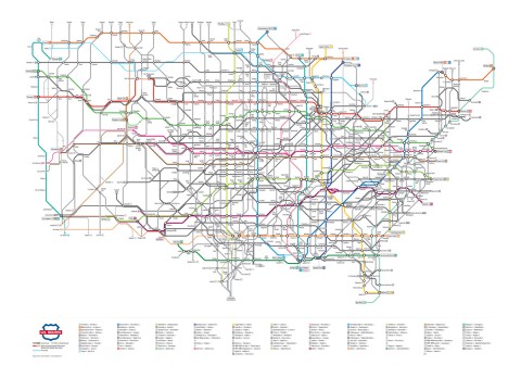
The Numbered US Routes as a Subway Map (by Cameron Booth)

Portland-based Graphic Designer Cameron Booth has produced a very nifty rendition of the US Highway system, shown in a style similar to the London Underground and other subway maps.

I am seriously considering buying a copy of the poster just so I can spend some more time searching through the details in this work of art.  It is difficult to make out all of the details from the higher-res online version (linked from the image here), however some patterns are certainly evident.

I may be biased, but to my eyes Chicagoland certainly stands out as the major transportation hub of the nation.  In general there is a lot more action in the nation’s midsection than on the coasts (especially the west coast).  The map certainly makes it appear that “fly-over” country has a pretty rich network of roads and truck stops.  Kind of the opposite effect of the famous “New Yorker’s View of the World” images that show Manhattan island as a huge shape filling out more than 50% of the national map.   This map is the latest in a series, the designer has many interesting detail images and description of the process on his web site.  If you like maps and/or infographics I recommend spending a few minutes at the site to check out his work.

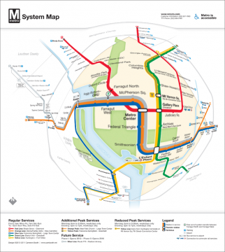
Selective magnification of an updated DC metro map. Original map design by Cameron Booth.

I was also interested to see Cameron Booth’s redesign of a map for the D.C. Metro System.  Many years ago I had worked on a focus+context tool for allowing selective magnification of the old D.C. Metro map according to where the viewer is in the system.  The resulting image was probably my most popular one ever from that period of my research, and got republished in quite a few journals and books.  Just for fun, I loaded Mr. Booth’s updated map into my PhotoXform iPad App for nonlinear magnification to see what it would look like.  The results are as you see here.  While the magnification is effective in showing local details, the presentation could be enhanced by treating label size more independently of the spatial magnification function.  That would allow the labels to be readable throughout the image, and simply spaced out better (or de-cluttered) in the region of interest.  In addition, although the radial magnification function has a nice correspondence to the fisheye lens concept, it also disrupts the orthogonal line placement that was no doubt an intended feature of the design.

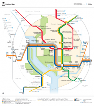
Orthogonal Selective Magnification of DC Metro Map (original design by Cameron Booth)

To address this last issue, I tried revisiting the map with an alternate magnification function from PhotoXform. This time I used a transformation that would preserve the orthogonal line layouts in the original design, and produced a very natural looking map.  The selective magnification effect is so non-distorting as to be almost unnoticeable, yet at the same time it does provide significant resolution enhancement in the region of interest.  I would love to do an user study one day to ascertain if this type of presentation is as intuitive to the uninitiated viewer as it is to my expert eyes.  My hunch is that this type of selective magnification (perhaps with some additional subtle visual cues) could be understood without additional explanation. 

If you have thoughts or comments on this, I’d love to hear them.  You can leave a comment here, or connect via one of the channels at the top right of this page.

Lytro Light Field Cameras

[singlepic id=207 w=320 h=240 float=left]Photographers and computer graphics geeks alike have been looking forward to the release of the Lytro Light Field Camera early this year.  I pre-ordered mine last year and am hoping to get it in March if everything goes according to plan.  The light field camera (also sometimes referred to as a plenoptic camera) has the potential to open up a new generation of techniques for capturing, viewing and exploring images.

Tracing the direction and intensity of light in an artificial computer generated scene has been a well researched topic over the years, involving such techniques as radiosity and ray tracing.  These techniques have been used to drive advances in realistic computer graphics that are now routine to see in video games and movies.  In essence the light field camera brings these theoretical computer generated graphics techniques into the real world and “reverse engineers” a captured scene by recording both the direction and intensity of the incoming light across the entire sensor array.

From my initial read of Lytro CEO Ren NG’s Ph.D. Thesis, the new technology creates a 4D mapping of the scene as a set of “ray pixels” holding light intensity and incoming direction vector at each sensor location.  Through software treatment of the sensor data it is possible to then change how the scene appears in a 2D image.  The most frequently given examples shown for interacting with the scenes are by changing the focus points and creating 3D type effects.  This technology represents a fascinating fusion of photography and computer graphics, and I am sure that I will have much more to write about this technolgy in the future.

For now though, I am interested in the consumer perspective for this new technology.  Lytro seems to be focussing (hah!) on a fairly broad range of customers at this point, with a simple to use device that can be enjoyed by complete novices.  The device appears to have relatively low resolution compared to DSLRs and even consumer compact cameras.  That makes complete sense for their current startup status; once they get the first version out the door and the revenues start flowing in then they can work on creating tighter sensor array densities and higher image resolutions.

[singlepic id=208 w=320 h=240 float=right]From a photographer’s perspective the Lytro camera offers a huge advantage in not having to attend too much to finding the best focussing distance for the shot.  In addition, the camera does need not to spend time autofocusing before the shot, which is a big cause for the slowness of consumer cameras with their slow contrast detect focussing technique.  From the examples shown on their website it appears that the device is able to capture a fairly large depth of field in a single shot, but not an infinite depth of field.  This has the potential to be a boon for certain types of photographers who require a fast reacting and highly mobile camera, street photographers come to mind immediately.  This could potentially also be useful for other types of photography where a large depth of field is desirable, such as landscape and architectural photography.  I think the usefulness in these latter types would be more limited however, as the use of tripods and smaller aperture settings with longer exposures can already provide a fairly large depth of field.  It is pretty easy to simulate out-of-focus areas in an in-focus image using Aperture or Photoshop.

After the scene is captured, the interesting question becomes what are the cool and useful ways of allowing the viewer to see and interact with those images.  “Cool” and “useful” aren’t always the same thing when it comes to new technology.  The Lytro site has several flash examples allowing the user to click on regions of an image and have the focus point shift to that part of the image.  It isn’t completely clear to the outsider what is happening under the hood, but it appears that the interaction is telling the software to choose a single focus plane from the scene and render the image with that plane in focus.  My guess would be that it uses a contrast detect algorithm to find the plane of maximum focus in the 2D region of the touch, and then apply that focusing plane to the entire image. 

This is really cool to watch, but is it actually useful?  Lytro is making a big effort to make it easy for people to view and share their images online, pointing out that the Facebook community is projected to publish 100 billion (thousand million) photos online in 2011.  Clearly online is “where the eyeballs are” so it makes sense to go after that market aggressively, but will the average facebook member — faced with dozens of photos in their stream every day — really want to have to click and explore individual photos to get the most of them?  Pushing focus presentation choices out to the viewer empowers them, but with more and more online photos to view and attention spans even shorter on-line than in the real world, there is a potential conflict.   Once the novelty wears off there is a need for a value proposition that makes it worthwhile for both the producer and consumer of the scenes to bring the additional complexity to the viewing process.

In my opinion this is the truly critical area for Lytro to address, and the richest opportunity for creating a paradigm shifting sharing and viewing experience.  My guess is that the best value propositions will arise not from allowing viewers to interact directly with the field data to shift focus fields around, but rather from intermediate software layers that allow creatives and producers to produce semi-guided presentations of the scene to the viewer.  For example an interactive ad creator could use animated focus shifts to guide the viewer through a sequence of impressions in a single image in a subtle fashion.  The need that I imagine for guided tours through the 4D light field dataset is somewhat analogous to what we saw in the graphics and visualization community in the 1990’s and 2000’s: users given free reign to navigate unconstrained through virtual 3D spaces could quickly become lost or fail to observe the critical features.  A variety of constrained navigation techniques were introduced to allow novice and expert viewers to more easily move through the 3D worlds.  I see a similar set of techniques arising to deal with the 4D light field camera sensor data.

It remains to be seen whether Lytro’s light field camera will be just a cool gadget or something more enduring in the market.  My guess leans more towards the latter, but there are substantial software and marketing hurdles to got over before that will happen.  My hope is that Lytro will open up a Developers SDK for their file formats that lets them tap into a rich community of developers on different platforms.  They have indicated some tentative support for this idea, but nothing is on the table yet.  Of course when these light field principles are applied to video, a whole set of ripe opportunities opens up, in addition to some formidable engineering challenges.  I’ll write more about that in a future post.

One thing is for sure, this is going to be an interesting few years as the technology enters the market, and I will be following it fairly closely.  Please select one of my feeds from the “Stay in Touch” area at the top of this page for more updates and examples when I get my own copy of the camera to experiment with.
Network

[nggallery id=4] Qualitative Network Visualization (QNV) is the product of a multi-year project to research effective mappings from cluttered high-frequency network traffic space into more continuous and easily processed visual representations.

Stay Connected