Category Archives: Sports

Visualizing Chicago Bears player and salary cap changes from 2013 to 2014

NFL Chicago Bears salary cap comparison for the 2013 and 2014 seasons.

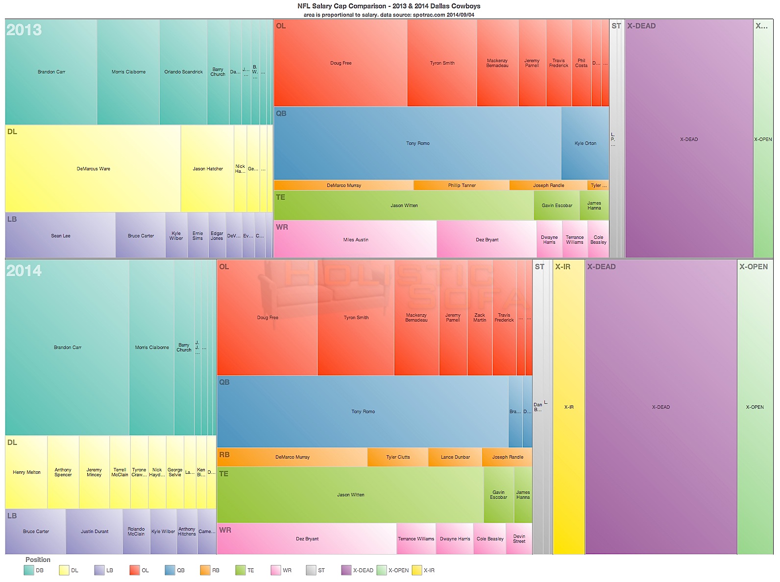
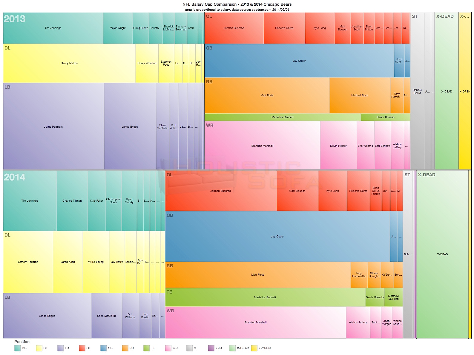
NFL Chicago Bears salary cap comparison for the 2013 and 2014 seasons. Area is proportional to salary.

My other favorite NFL team is the local Chicago Bears.  There have been some big changes this year for the Bears, as the visualization here shows.  Player are represented by individual rectangles, with the area of each rectangle being proportional to the player’s salary for that year.  The players are grouped into player positions and colored similarly.  Then the positions are grouped into Defense, Offense and Special Teams which are shown as three stacks of position groups from left to right.  Dead money from departed players and injured reserve are shown towards the right side of each row, along with open salary cap space.  Finally, all of the above are collected in to two major rows for the 2013 (top) and 2014 (bottom) season.  Click on the image to see a full size version of the image with greater detail.

A few things jump out from looking at this visual.

  1. Julius Peppers was collecting a huge portion of the overall defensive spending in 2013.  Visually it appears to be around 20%.
  2. The dead money component (X-DEAD) jumped significantly in 2014.  This is due almost entirely to the $8,000,000 cap hit created with the departure of Peppers.
  3. 2014 signings of Lamar Houston and Jared Allen amount to less than what Peppers was making in 2013.  I think this could be a good tradeoff for the Bears as Peppers was a good but not dominating contributor last season.  The distribution of spending between DL, LB and DB is much more even in 2014.
  4. The Bears are spending much more on offense than defense this year.  In 2013 the spending between the two categories was more equal.  In 2013 the Bears offense was ranked much higher than their defense.  It will be interesting to see if the rankings diverge or converge with the new spending pattern this season.
  5. Spending on defense is down and spending on offense is up in 2014 for the Bears.


Overall impressions: the Chicago Tribune had an article in the Opening Week Sunday edition pointing out that three recent Superbowl champs made it there with an offense ranked 8th or higher and a defense ranked 21st or lower.  The Bears certainly look capable of repeating that formula this year.  Last year that only got them an 8-8 record though, so it is obviously no guarantee of success.  I am a bit concerned about the age of the players and potential weakness at LB and Safety, but if they can hold together with the upgraded defensive line then there is a good chance the overall defense could improve this year.  I haven’t done a schedule analysis yet, but the information here is telling me that 10-6 is a good possibility this year.

Why the Dallas Cowboys may be in trouble this year

NFL Dallas Cowboys salary cap comparison for the 2013 and 2014 seasons.

NFL Dallas Cowboys salary cap comparison for the 2013 and 2014 seasons. Area represents salary.

Football season is finally here, and with it begins my annual hope and frustration with the Dallas Cowboys.  The Cowboys had a great run back in the 90’s, but the last time they won a playoff game was in 2009 vs the Eagles and it’s been close to 20 years since they went any deeper into the playoffs.  Which is not to say that it has not been entertaining following them over the recent years.  There have been many thrilling comebacks and heartbreaking last minute losses.  This year there have been some big changes in the defense, and the salary cap has played a larger role than in years past.

I created this visualization to provide a graphical overview of the differences.  You can click on the image to see the full size version.  The area of each player’s box is proportional to their salary.  Similarly, the players are grouped into positions, and then into Offense/Defense/Special Teams.  A few things jump out right away:

  1. Overall spending on defense (as defined by the left column in each year) is way down in 2014.  This is mainly due to the departure of DeMarcus Ware and Jason Hatcher from the lineup, and overall spending on the defensive line is down significantly this year, spread over a larger number of lesser known players.  Only time will tell if the new line is able to be effective, but it does seem that the Cowboys were not getting the production that they were previously accustomed to from Ware last year.
  2. Star linebacker Sean Lee does not show up on the Defense in the 2014 season, because he has been moved to the Injured Reserve category (X-IR).  This, combined with dead money space (X-DEAD) from the departure of Ware and Hatcher has created a huge dead money space for the Cowboys this year.  This is money that cannot be used to play active players and that counts against the salary cap.
  3. The 2014 offense looks very similar to the 2013 offense, as seen in the next column to the right of the defense column.  Miles Austin left for Cleveland so spending on receivers is down a bit, and spending on Tight Ends and Offensive Line is up a bit.
  4. The Cowboys still have a bit of free cap space to catch a player during the season.  Like Michael Sam who they seem to be in the process of signing.

There’s my quick visual analysis of the changes for the Cowboys this season.  My prediction for them this year: it could be a thrilling offense to watch, but unless some of the unproven defensive linemen can step up in a big way the could be in big trouble trying to stop opponents.  As a lifelong Cowboys fan I would like to think they are a 11-5 division champion, but as a betting man I can’t give them much better than a 9-7 record with a possible wildcard spot.

[UPDATE: replaced visual with a better one having a horizontal layout and better color map]

All Time Olympic Medal Wins

Now that I’ve had a chance to recover a bit from the deluge of London 2012 olympic-related infographics and visualizations, I thought it would be interesting to see how the top countries compare in terms of total number of medals won over the history of their participation in the summer games. I used Tableau to do an initial analysis, and then selected the top 10 countries for the D3 animated line graph that is shown here. Each line shows the accumulated total of medals for that country for all years up to and including that year.  The circles are sized proportionally to the average number of medals won each year over the years that the country was participating.  Mouse over the chart elements for details.

I had expected the USA to show up well on this graph, but was surprised at just how dominant they have been since 1896.  This certainly illustrates one aspect of “the American Century”.  China looks to be an up and coming nation in the medal count, however it remains to be seen if their rise will continue over the long haul or if it will flatten out (or disappear) as has happened with other countries.  The US has won an average of 96 medals per year, which is topped only by the old Soviet Union at 112 medals per year.

This graphic was inspired by the awesome view of Mariano Rivera’s all time saves record by the New York Times.  Note that the line for Germany does not include any medals from the period when it was split into West and East Germany.  Arguably those years should be added in, however I am going with the official medal counts as reported by the IOC. I also used a linear scaling on the circle sizes rather than a sqrt scale, in order to emphasize the differences between averages.

Overview of Historical Win Loss Records for NFL Teams

With the 2012 NFL Football season kicking off in just 41 days, my thoughts have been turning towards football, and the great data site for the sport at pro-football-reference.com .  I’ve spent some time trawling through there to get some rich data for future visualization projects, but wanted to start with a simple overview of the historical win/loss records for the active NFL teams.  The results are pretty gratifying to see for a life-long Dallas Cowboys fan who adopted the Chicago Bears as his #2 team when he moved to the area some 11 years ago.  I just wish those historical records could be transformed into a Super Bowl in the near future!  ToDo: find an easy way to display this data within wordpress in vector SVG/PDF format in a way that is reasonably cross-browser compatible. 

Historical Win-Loss Records for all Active NFL Teams


Stay Connected