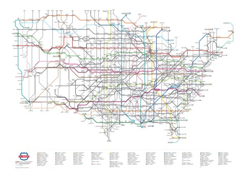
Portland-based Graphic Designer Cameron Booth has produced a very nifty rendition of the US Highway system, shown in a style similar to the London Underground and other subway maps.
I am seriously considering buying a copy of the poster just so I can spend some more time searching through the details in this work of art. It is difficult to make out all of the details from the higher-res online version (linked from the image here), however some patterns are certainly evident.
I may be biased, but to my eyes Chicagoland certainly stands out as the major transportation hub of the nation. In general there is a lot more action in the nation’s midsection than on the coasts (especially the west coast). The map certainly makes it appear that “fly-over” country has a pretty rich network of roads and truck stops. Kind of the opposite effect of the famous “New Yorker’s View of the World” images that show Manhattan island as a huge shape filling out more than 50% of the national map. This map is the latest in a series, the designer has many interesting detail images and description of the process on his web site. If you like maps and/or infographics I recommend spending a few minutes at the site to check out his work.
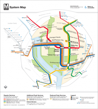
I was also interested to see Cameron Booth’s redesign of a map for the D.C. Metro System. Many years ago I had worked on a focus+context tool for allowing selective magnification of the old D.C. Metro map according to where the viewer is in the system. The resulting image was probably my most popular one ever from that period of my research, and got republished in quite a few journals and books. Just for fun, I loaded Mr. Booth’s updated map into my PhotoXform iPad App for nonlinear magnification to see what it would look like. The results are as you see here. While the magnification is effective in showing local details, the presentation could be enhanced by treating label size more independently of the spatial magnification function. That would allow the labels to be readable throughout the image, and simply spaced out better (or de-cluttered) in the region of interest. In addition, although the radial magnification function has a nice correspondence to the fisheye lens concept, it also disrupts the orthogonal line placement that was no doubt an intended feature of the design.
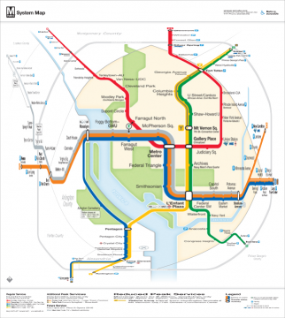
To address this last issue, I tried revisiting the map with an alternate magnification function from PhotoXform. This time I used a transformation that would preserve the orthogonal line layouts in the original design, and produced a very natural looking map. The selective magnification effect is so non-distorting as to be almost unnoticeable, yet at the same time it does provide significant resolution enhancement in the region of interest. I would love to do an user study one day to ascertain if this type of presentation is as intuitive to the uninitiated viewer as it is to my expert eyes. My hunch is that this type of selective magnification (perhaps with some additional subtle visual cues) could be understood without additional explanation.
If you have thoughts or comments on this, I’d love to hear them. You can leave a comment here, or connect via one of the channels at the top right of this page.


