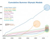
Now that I’ve had a chance to recover a bit from the deluge of London 2012 olympic-related infographics and visualizations, I thought it would be interesting to see how the top countries compare in terms of total number of medals won over the history of their participation in the summer games. I used Tableau to do an initial analysis, and then selected the top 10 countries for the D3 animated line graph that is shown here. Each line shows the accumulated total of medals for that country for all years up to and including that year. The circles are sized proportionally to the average number of medals won each year over the years that the country was participating. Mouse over the chart elements for details.
I had expected the USA to show up well on this graph, but was surprised at just how dominant they have been since 1896. This certainly illustrates one aspect of “the American Century”. China looks to be an up and coming nation in the medal count, however it remains to be seen if their rise will continue over the long haul or if it will flatten out (or disappear) as has happened with other countries. The US has won an average of 96 medals per year, which is topped only by the old Soviet Union at 112 medals per year.
This graphic was inspired by the awesome view of Mariano Rivera’s all time saves record by the New York Times. Note that the line for Germany does not include any medals from the period when it was split into West and East Germany. Arguably those years should be added in, however I am going with the official medal counts as reported by the IOC. I also used a linear scaling on the circle sizes rather than a sqrt scale, in order to emphasize the differences between averages.