Author Archives: Alan@HolisticSofa

Interacting Inside the Visualization Box

Hierarchical view of spending by city, state and region.

Hierarchical view of spending by city, state and region.

IBM just posted a quick blog post of mine on their Business Analytics blog site.  The post addresses the general theme of visual navigation, comparing old school approached with external controls vs. integrated approaches that combine the visual views and navigational controls within a single metaphor.   To illustrate these concepts I compare the use of traditional dashboard tabbed hierarchies with a single hierarchical visualization that shows multiple levels of detail simultaneously. Read the short article for more details.  

Visualizations and Vehicles

Scatter Plot as Delivery Truck

Scatter Plot as Delivery Truck

It’s been awhile since I published on this blog, which is because I joined IBM’s new Center for Advanced Visualization  last December and have been busy getting up to speed on everything that is happening there.  It is an exciting opportunity for me, I will be working to help shape IBM’s recent and significant investments in effective visualization and visual analytics across IBM.  There will be much more for me to post about that in the future, but for starters here is a link to my first post on their Business Analytics blog.  It is a somewhat humorous comparison between visualization chart types and vehicle types.  I often encounter novice chart users who don’t know what type of chart to use for their data.  This post is meant to reinforce some of the conventional wisdom in the visualization community as to how to select chart types, hopefully in a memorable way.

For those of you lacking the time to click through for the entire article: Pie Chart == Horse & Buggy in my system.  You’ll have to click through to find out what vehicle matches the 3D Pie/Bar chart however.

All Time Olympic Medal Wins

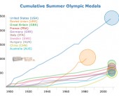
Now that I’ve had a chance to recover a bit from the deluge of London 2012 olympic-related infographics and visualizations, I thought it would be interesting to see how the top countries compare in terms of total number of medals won over the history of their participation in the summer games. I used Tableau to do an initial analysis, and then selected the top 10 countries for the D3 animated line graph that is shown here. Each line shows the accumulated total of medals for that country for all years up to and including that year.  The circles are sized proportionally to the average number of medals won each year over the years that the country was participating.  Mouse over the chart elements for details.

I had expected the USA to show up well on this graph, but was surprised at just how dominant they have been since 1896.  This certainly illustrates one aspect of “the American Century”.  China looks to be an up and coming nation in the medal count, however it remains to be seen if their rise will continue over the long haul or if it will flatten out (or disappear) as has happened with other countries.  The US has won an average of 96 medals per year, which is topped only by the old Soviet Union at 112 medals per year.

This graphic was inspired by the awesome view of Mariano Rivera’s all time saves record by the New York Times.  Note that the line for Germany does not include any medals from the period when it was split into West and East Germany.  Arguably those years should be added in, however I am going with the official medal counts as reported by the IOC. I also used a linear scaling on the circle sizes rather than a sqrt scale, in order to emphasize the differences between averages.

Lytro Light Field Camera: Initial Review

I received my Lytro Light Field Camera back in March of this year.  Unfortunately it arrived the day after I left for my vacation in Beijing, so I missed a great chance to put it through the paces in an exciting new (to me) environment.  Since returning back from that vacation I’ve had a bit of time to play around with it  and form some initial impressions.  The announcement of this camera was met with a fair deal of skepticism from many corners of the traditional photography community.  Certainly the specifications for this camera along the traditional metrics of ISO performance, megapixels, and frame rate is lacking.  However I view owning this camera as potentially akin to being an initial purchaser of an original 128K Macintosh Computer back in 1984: it’s not clear yet if this is the start of a great revolution, but there is some prospect for that.  Then again, there’s also the prospect that this is more like buying the much less successful Apple Lisa a couple of years earlier.

I had reduced expectations for this camera, at least as far as the conventional metrics go.  I found that in good lighting conditions it was possible to get quite decent — if unexceptional — pictures with the Lytro.   In my unlit studio I managed to capture this photo of my restless cat, which the Lytro auto-exposed at ISO 3200 1/60 (the camera has a fixed f/2.0 aperture).  There were quite a few other blurry photos that didn’t make the cut from that session, however.  One area where I was looking forward to improved performance was in the responsiveness for quick shot street-type photography.  The post-exposure focusing feature of the Lytro offers the possibility of faster response times, as there is no need for slow contrast-detection autofocusing (that is used in traditional point and shoot cameras) prior to registering the image on the sensor.  In this regard I got mixed results.  It is true that the response time does not have the delay for focus of my Canon G12 in Auto Focus mode, however there does still seem to be more delay than I get with my DSLRs.  Furthermore, it seems as if the shutter speeds chosen by the camera are slightly on the slow side for quick action photography which also makes it susceptible to showing camera shake when the shutter button is pressed.  Perhaps with some more operator experience I will be able to work around this.  Some form of Image Stabilization in a future version would also go a long way to making this a quick shooter.

Read on after the jump to find out why people are asking me if this camera can measure glucose levels, and what the future may hold for this technology.

Read more ...

Overview of Historical Win Loss Records for NFL Teams

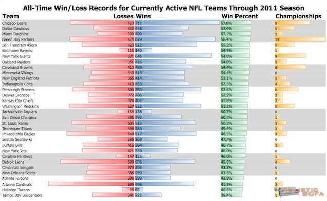
With the 2012 NFL Football season kicking off in just 41 days, my thoughts have been turning towards football, and the great data site for the sport at pro-football-reference.com .  I’ve spent some time trawling through there to get some rich data for future visualization projects, but wanted to start with a simple overview of the historical win/loss records for the active NFL teams.  The results are pretty gratifying to see for a life-long Dallas Cowboys fan who adopted the Chicago Bears as his #2 team when he moved to the area some 11 years ago.  I just wish those historical records could be transformed into a Super Bowl in the near future!  ToDo: find an easy way to display this data within wordpress in vector SVG/PDF format in a way that is reasonably cross-browser compatible. 

Historical Win-Loss Records for all Active NFL Teams


Stay Connected