Category Archives: Visualization

Interacting Inside the Visualization Box

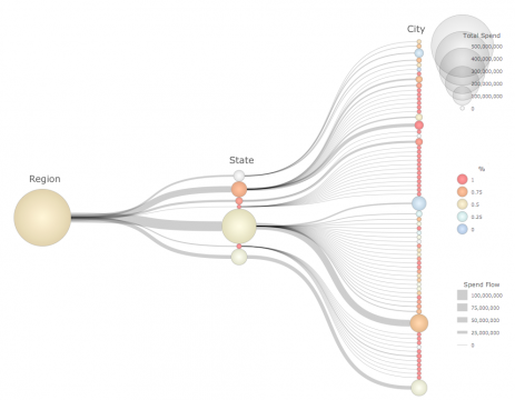
Hierarchical view of spending by city, state and region.

Hierarchical view of spending by city, state and region.

IBM just posted a quick blog post of mine on their Business Analytics blog site.  The post addresses the general theme of visual navigation, comparing old school approached with external controls vs. integrated approaches that combine the visual views and navigational controls within a single metaphor.   To illustrate these concepts I compare the use of traditional dashboard tabbed hierarchies with a single hierarchical visualization that shows multiple levels of detail simultaneously. Read the short article for more details.  

Visualizations and Vehicles

Scatter Plot as Delivery Truck

Scatter Plot as Delivery Truck

It’s been awhile since I published on this blog, which is because I joined IBM’s new Center for Advanced Visualization  last December and have been busy getting up to speed on everything that is happening there.  It is an exciting opportunity for me, I will be working to help shape IBM’s recent and significant investments in effective visualization and visual analytics across IBM.  There will be much more for me to post about that in the future, but for starters here is a link to my first post on their Business Analytics blog.  It is a somewhat humorous comparison between visualization chart types and vehicle types.  I often encounter novice chart users who don’t know what type of chart to use for their data.  This post is meant to reinforce some of the conventional wisdom in the visualization community as to how to select chart types, hopefully in a memorable way.

For those of you lacking the time to click through for the entire article: Pie Chart == Horse & Buggy in my system.  You’ll have to click through to find out what vehicle matches the 3D Pie/Bar chart however.

All Time Olympic Medal Wins

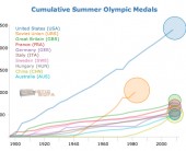
Now that I’ve had a chance to recover a bit from the deluge of London 2012 olympic-related infographics and visualizations, I thought it would be interesting to see how the top countries compare in terms of total number of medals won over the history of their participation in the summer games. I used Tableau to do an initial analysis, and then selected the top 10 countries for the D3 animated line graph that is shown here. Each line shows the accumulated total of medals for that country for all years up to and including that year.  The circles are sized proportionally to the average number of medals won each year over the years that the country was participating.  Mouse over the chart elements for details.

I had expected the USA to show up well on this graph, but was surprised at just how dominant they have been since 1896.  This certainly illustrates one aspect of “the American Century”.  China looks to be an up and coming nation in the medal count, however it remains to be seen if their rise will continue over the long haul or if it will flatten out (or disappear) as has happened with other countries.  The US has won an average of 96 medals per year, which is topped only by the old Soviet Union at 112 medals per year.

This graphic was inspired by the awesome view of Mariano Rivera’s all time saves record by the New York Times.  Note that the line for Germany does not include any medals from the period when it was split into West and East Germany.  Arguably those years should be added in, however I am going with the official medal counts as reported by the IOC. I also used a linear scaling on the circle sizes rather than a sqrt scale, in order to emphasize the differences between averages.

Visualizing State & Local Taxation Levels by Income with D3

I am writing this post for two reasons, the first of which has nothing to do with taxation, and the second of which has nothing to do with visualization.  Like peanut butter and chocolate however, they do go well together.

My first reason for this post was to play with the D3.js toolkit for constructing an interactive, animated visualization with real world data; and then see how nicely it would embed in a wordpress post like this one.  I have to say that the more I use D3 the more impressed I am.  There’s a bit of an adjustment to make if you are used to a more procedural approach to defining graphics (such as QuickDraw or OpenGL), however the data joins and enter/append/exit methods for managing changing data are rather elegant.  D3 is certainly another nail in the coffin for Flash, not requiring any client-side install.  I look forward to seeing the development of the new authoring tools and libraries that are being built on top of D3.

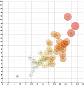
My second reason for doing this post was to see what the distribution of state and local taxes is across states for different income groups.  This data is from the Census Bureau 2008, and is estimated for a family of 4 living in the largest urban center of each state.  The taxes included are not just income and property taxes, but also things like vehicle registration and other taxes.  What is expected but still striking to see about these data is  how consistently higher the taxes are on the upper eastern seaboard at all income levels.  In addition, the view clearly shows how lower incomes pay a larger share of income towards these local taxes, as they are not all tied to income level.  These data to not factor in federal taxes, however given that most state and local taxes are deductible on the federal tax return, you can see how the federal tax code is in effect is creating a subsidy for the higher taxation states and lower income individuals, relative to the states with lower taxation levels and higher incomes respectively.

A Gem of an App for Visual Thinkers

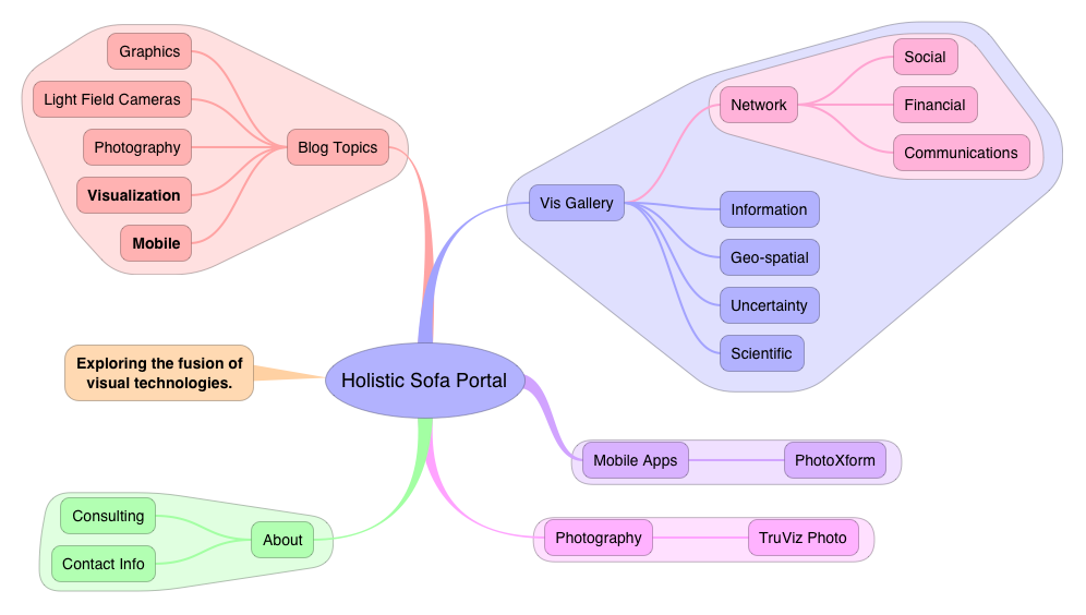
I don’t often get the urge to write product reviews, and you will rarely see them on this site.  However I have recently encountered a fantastic iPad app for mind mapping that has made its way into my everyday workflow and which deserves a shout out from the Sofa.  iThoughtsHD is a mind mapping app for the iPad.  Not quite a visualization tool per-se, more of a diagramming tool.  However the ease with which it can quickly and fluidly generate complex hierarchical (and to some degree cyclical) information allows you to build up fairly sophisticated visual structures with a clean layout and appealing aesthetics.
iThoughtsHD View of Holistic Sofa Website

iThoughtsHD View of Holistic Sofa Website

I have always been a highly visual thinker, using my visual channels to expand my short term mental storage so that I can work with larger and more complex sets of facts and relations at one time.  The whiteboard was my old-school method for thinking visually, however there are many limitations with that method such as inability to save and interact with different whiteboard states, or difficulty in rearranging elements on the board.  Quite a few years ago I tried my first mind mapping software, a program called DevonThink for the Macintosh.  At the time I got the impression that the technology was not quite ready for me yet.  Although powerful, I found the interface cumbersome and the visual expressiveness limited.  I gave up on the whole mind mapping thing at that point, and instead switched to lists to organize my thoughts and plans.  Lots and lots of lists with a variety of software packages.  Currently my main list makers are OmniFocus (iPhone, iPad, Mac) for managing hierarchical todo lists and projects, OmniOutliner (Mac) for detailed projects and CarbonFin Outliner (iPad) for note taking on the go.  These products are all highly capable, and in some cases indispensable, however they’ve also left me wanting more for general brainstorming and rapid thought construction.  While looking around in the App store for alternatives I came across iThoughtsHD and gave it a try.

The example screens in the App Store were pretty slick looking, I was initially a bit skeptical, thinking that this was going to be just another pretty interface.  Putting the app through the paces however, I discovered that the interface is nicely thought out with a minimum amount of touches, menus and palettes required to get thoughts organized.   Add in a few more touches and I was creating some nice visual patterns through grouping, coloring, edge and text styling.  iThoughtsHD provides unobtrusive, direct manipulation of my thoughts that allows me to quickly organize, prioritize and adjust.  I am particularly a fan of the grouping feature, which allows hierarchical branches to be encapsulated into independently colored bubbles.  Although it might be tempting to dismiss this feature as eye candy, I actually find it a useful feature for making certain subgroups stand out from the parents and siblings in the hierarchy.  IThoughtsHD also provides nice tools for automating the layout of the diagram, which can be overridden if required.

Obviously there are scalability limits for this type of visual representation, however that also applies to any other hierarchical list representation.  iThoughtsHD makes it easy to collapse and expand branches, and to zoom in and out of regions.  In practical use I have found it works beautifully with networks up to around 50 nodes with several layers of hierarchical depth.  It’s possible that this can be pushed higher, however I have not tried that yet.  I love the way that iThoughtsHD gives me a big picture overview of my information, while still allowing me to easily work with the finer details.  I use it for a variety of tasks including regular SWOT (Strengths, Weaknesses, Opportunities, Threats) analysis and project planning.  The largest project I have used it for was to plan an hour long phone consultation with a client, for which I created an overview of the issues and technologies for discussion.  The visual mind map representation provides natural clustering of ideas which facilitate a natural two-way flow of conversation through the issues that I find to be superior to checking items off an ordered hierarchical list.   iThoughtsHD also allows the information to be easily shared either visually PNG or PDF images, or in many different outliner formats including OPML.

Highly Recommended.
Stay Connected