Excellent Question. The answer has many layers. Let’s peel back one or two of them.
Holistic Sofa has been an evolving concept for me over the past 20 years, when my interest in computer graphics really kicked in. I’d played around with graphics on computers before then, including programmed text and sprite graphics, and QuickDraw on the Macintosh. Things got more serious for me when I took Bill Kocay’s Advanced Linear Algebra class in my junior year at the University of Manitoba. I had a good aptitude for math as a young man, but not much passion for it. Dr. Kocay is an excellent teacher however, and his enthusiasm got me kind of enjoying matrix manipulations. A month into the class he showed how one of the matrix operations he had been teaching us could be used to create a perspective projection from 3D space into a 2D computer display. To this day I remember him standing at the overhead projector twisting his hand to illustrate the transformation and thinking to myself “OMG, this is so cool!”.
OK, I wasn’t actually thinking “OMG” literally, because texting wasn’t even around back then, but you get the point.
You’ve got to understand that back then there was no OpenGL or graphics cards on desktop computers. Heck, my Mac Plus didn’t even have a floating point processor. There were some primitive 3D graphics in games, but they were all hand-rolled deals (Microsoft Flight Simulator is maybe the best example, Doom and Wolfenstein 3D didn’t exist yet), and there were no APIs of any sort to help program 3D graphics on your machine. I drove home quickly after class and worked late into the night (actually, early into the morning) trying to create a 3D rendering of a simple tetrahedron using my new linear algebra to convert the 3D data model into 2D QuickDraw bit drawing operations on my Mac Plus. When I finally got the little 4-sided shape showing up on my screen it was a magical moment for me. I was fully and completely hooked on computer graphics, only I didn’t yet realize it fully.
“Fascinating”, I can almost hear you not saying to yourself, “but what’s all this got to do with a Holistic Sofa?”.
The following weeks were filled with many late nights as I fine tuned the code so that it would run efficiently enough to show an animated tetrahedron rotating and bouncing through 3D space, then multiple tetrahedra, and eventually even cubes. I spent hours writing integer based lookup tables for the calculations so that I could avoid the use of decimal points that would kill the interactive performance on my Mac. Eventually I released a shareware FKEY (remember those?) screensaver to the Mac community called “Cubist“.
Cubist was well received and a lot of fun to make, but I wanted more. More geometric complexity and more meaning. Tetras and Cubes were too generic. There were no online 3D model markets like TurboSquid back then, all of my 3D models were painfully constructed by hand entering the 3D coordinates for the objects in text. The chances of my being able to construct a decent model of anything interesting by hand were about the same as the chances that Joan Jett and the BlackHearts would show up at my birthday party to play I Love Rock and Roll.
I didn’t realize it back then, but I was encountering one of the most difficult and persistent hurdles that occurs throughout the computer graphics and visualization fields: access to good data or models. This has been a constantly recurring issue for my colleagues and I over the years. Sample or toy models are clean, simple and boring. Interesting models are difficult to find and import, filled with exceptions that require special treatment and a general pain to deal with. That’s not 100% the case of course, but it is generally true.
This was the start of my long, dark search for a more interesting 3D model that I could render on my Mac Plus. It had to be easy enough that I could actually stand a chance at hand coding the coordinates, but also have some intrinsic interest greater than a simple geometric shape. The answer came to me while reading Dirk Gently’s Holistic Detective Agency by Douglas Adams (I was a huge fan of both his Hitchhikers Guide to the Galaxy trilogies). There’s a recurring theme in that book where a moving crew gets a sofa stuck in a staircase, and a computer tries unsuccessfully to find a way to get it unstuck. A bolt of lightning struck me right then.

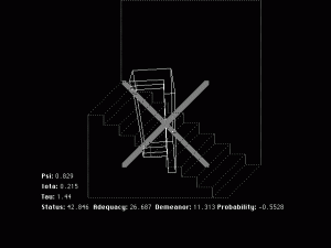
Holistic Sofa Screen Shot
Within a few days I had created a blocky looking sofa model and had it spinning around on my tiny little 9″ grayscale Mac screen. I dressed it up a bit with some rotating number counters, a crude staircase and a huge rejection “X” that would pop up from time to time to signal failure. Holistic Sofa was born! It was somewhat mesmerizing and mysterious to watch. Friends would come over to my house just to drink beer and watch the screen saver do it’s thing on my Mac. Holistic Sofa was eventually released as a shareware After Dark screen saver in 1992. I had managed to find Douglas Adams’ email address and sent him a note asking if he was OK with the release, and to my great surprise he replied not just once but twice to give it his blessing and ask for a copy for himself. Getting a personal email from my Sci-Fi author-hero Douglas Adams was definitely on the same level with having Joan Jett play at my birthday party!

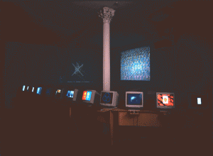
Holistic Sofa at Can You Digit
Over the next several years the Holistic Sofa screen saver became a sort of a cult hit in the Mac community; and in 1996 I was contacted by Tamas Banovich, who wanted to display Holistic Sofa in the upcoming Can You Digit digital art exhibition at his Postmasters gallery in Soho. You can see it in the image here being projected on the wall above the other displays, to the left of the column. These images are the only ones that remain from Holistic Sofa. The program no longer runs on modern macs. A few years ago someone posted a YouTube video of Holistic Sofa running on his 7600 Mac, which is as close as you can get to running it on your own machine these days.
Getting back to the original question then; Holistic Sofa marks the beginning of my journey into the fields of computer graphics and visualization. The Holistic Sofa graphics were primitive by present day standards, however they still resonated with a diverse community for decades beyond their creation. Over the past 20 years I have spent many years studying, conducting research, creating products and building companies in pursuit of the interest that was kindled during that period. That interest has also broadened into many related fields, about which I will write more later. From time to time I have gotten side tracked on non-graphics oriented work, however I always find myself coming back to making visual images with bits and pixels. It’s what I love.
More broadly, Holistic Sofa (Blog Edition) is my new platform for exploring advances in graphics and visualization and sharing them with the gentle reader. Part of this exploration will involve sharing products and techniques that I have developed myself, but it will also include pointers to new technologies that I see coming out on the horizon.
