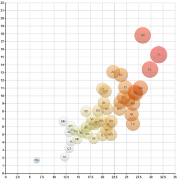
It’s been awhile since I published on this blog, which is because I joined IBM’s new Center for Advanced Visualization last December and have been busy getting up to speed on everything that is happening there. It is an exciting opportunity for me, I will be working to help shape IBM’s recent and significant investments in effective visualization and visual analytics across IBM. There will be much more for me to post about that in the future, but for starters here is a link to my first post on their Business Analytics blog. It is a somewhat humorous comparison between visualization chart types and vehicle types. I often encounter novice chart users who don’t know what type of chart to use for their data. This post is meant to reinforce some of the conventional wisdom in the visualization community as to how to select chart types, hopefully in a memorable way.
For those of you lacking the time to click through for the entire article: Pie Chart == Horse & Buggy in my system. You’ll have to click through to find out what vehicle matches the 3D Pie/Bar chart however.
