The Multidisciplinary Nature of Data Visualization, and the Key Factors to Creating a Successful Team
“How can I find the right talent to hire for our data visualization needs?”
This is a common question that I have heard very often over the years. The question occurs with increasing frequency as more organizations look to further develop their capabilities for communicating information more effectively and intuitively in the era of rapidly growing big data. The question reflects a deeper one of how to develop a visualization capability that will integrate well with the rest of the organization. It is a simple one line question, but there is not a simple one line answer.
Over the last 15 years I have worked and consulted with a large range of organizations across a wide array of project types and application domains with varying job roles. Through all of that experience I have had an opportunity to build up a deeper understanding of what skill sets and experiences need to be brought to the table for creating an effective data visualization capability. Here is the short outline of an answer, more details below.
- “Core Visualization” – the nuts and bolts of laying out data on a screen – is a specialization in its own right, with its own set of issues that need to be addressed including algorithms, hardware and software constraints and human factors.
- Core Visualization by itself does not usually provide a complete solution for the organization. Effective visualization in the real world requires tight couplings with a number of other disciplines. Principal among these are: User Experience, Design, Data/Analytics, and Domain Expertise. I call this combination of disciplines the “Data Visualization Pyramid”.
- Finding the right blend of capabilities to execute on all of these factors is a major challenge, and one which conventional education curricula and corporate/technical job descriptions often fail to capture adequately.
What do you really want when you say you want “data visualization”?
Visualization is a highly overloaded term. A simple keyword oriented search for talent using “data visualization” by your recruiting agent is unlikely to be very productive. It is worth taking a minute to clear up some potential for ambiguity or misunderstanding here. There are several distinct requirements and skill sets that organizations may have in mind when they think of “data visualization”, these distinctions also apply to the potential recruits who are describing their work experience.
- Charts & Tools: simple bar, pie and line charts using conventional tools such as spreadsheets or charting software.
- Infographics: using pictures and graphics to dress up the presentation of information. Often the information is relatively sparse compared to the amount of space taken, or is shaped to convey a particular point of view. Used extensively in media and advertising.
- Business Intelligence/Analytics Applications: Tableau, Cognos, Qlik are examples in this space of fairly comprehensive visualization tools requiring application developer experience. These tools are the next logical step beyond spreadsheet charts. While more capable that standard spreadsheet charts, they do not always guarantee effective visualizations as the developer can still inadvertently create unclear representations or visual clutter.
- Custom Visualization Development: creating novel visualization that are tuned to more detailed customer needs. These can be standalone systems, or integrated into the existing software stack.
Core Data Visualization Skills
Good data visualization looks easy. No special skills are required to consume a well crafted visualization, however a number of special skills are required to create one.
Effective data visualization has an almost magical quality: information is laid out on a screen with a rectangular grid of around a million pixels and then that information leaps across the 24″ gap between the screen and directly into your consciousness. It is an extremely high-bandwidth and personal connection between the software and the viewer. If done properly it can convey massive amounts of information to the user in an intuitive and actionable format. If done incorrectly it can result in a messy, incomprehensible collection of visual artifacts that take longer to sort out than looking at the raw data would.
Crafting effective visualizations is a specialized skill set that requires an understanding of human perception, cognitive processing, human factors, complex layout algorithms, software infrastructure, graphics processing, display hardware capabilities and more. Developing these skills requires a combination of education and experience that is not usually found in other areas of software development. The emergence of higher level visualization tools has helped to productize some of that specialized knowledge into a more consumer-friendly technology. Similarly, the emergence of developer libraries such as d3.js has helped the visualization researcher or developer extend their reach into more capable visualization systems. However the core understanding of how these factors come together to create an effective visualization is still very much up to the experience of the individual who is designing or developing the visualization for you.
In addition to these specialized core visualization considerations however, effective visualization in real world applications depends on a number of other disciplines which need to be well synchronized.
Foundations for the Data Visualization Pyramid
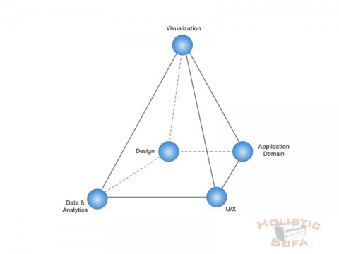
Data visualization is fairly unique in the software industry in that it touches on so many different spheres of development and expertise. In my experience there are four primary related spheres that are fundamental to the success of most data visualization projects: User Experience (UX), Design, Data/Analytics, and Domain Expertise. These form the foundation of the “Data Visualization Pyramid”.
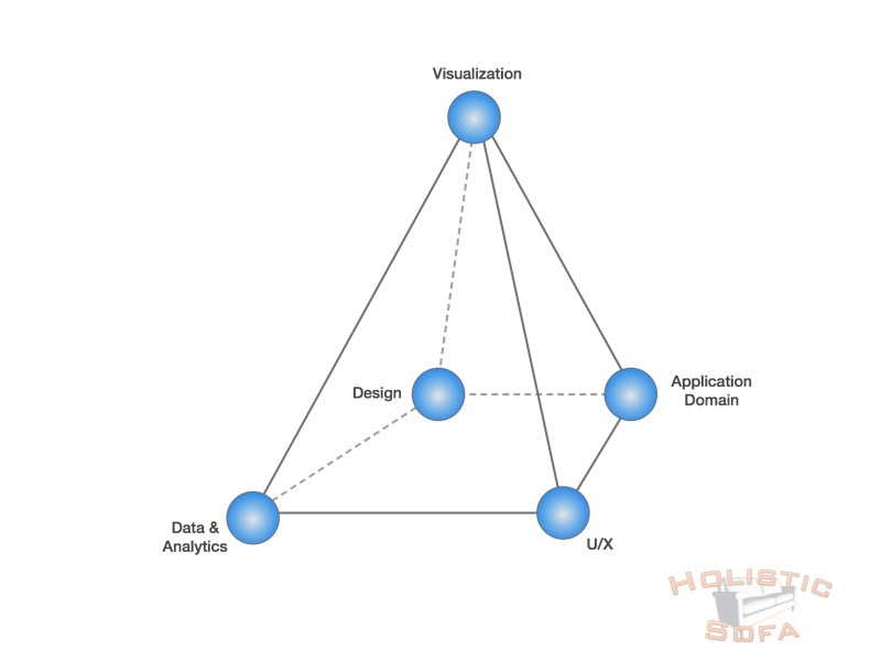
The Data Visualization Pyramid
These four spheres are commonly encountered categorizations within HR/Tech Job hierarchies, and the roles and responsibilities within them are generally well understood. What is less well understood is how to align these capabilities and coordinate them towards a robust data visualization facility capable of conveying complex insights.
Alert readers will note that I have placed visualization at the top of this pyramid. This is in contradiction with how most organizations position Visualization. Most organizations place Visualization at best in a sibling relation with the other spheres, or at worst in a subordinate relation. The reason for placing Visualization at the apex is simple: visualization is the mechanism through which all of the other spheres connect and the information is marshalled before presenting it to the viewer through the miraculous 24 inch long “final mile” to the viewer. Metaphorically, it is where the rubber meets the road.
I’d like to expand on that metaphor for a minute because it is highly illustrative. Cars are incredible marvels of technology, ergonomics and design. Centuries of innovation have gone into creating better motors, brakes, aerodynamics, safety and electronics. However, all cars have a single critical feature in common: the basic physical control of the vehicle (accelerating, slowing, turning) is completely dependent on the four small “contact patches” where the vehicle tires make contact with the road. All of the other systems need to communicate with the road through these contact patches. Similarly, all of your data needs to communicate with your users through your visualizations. Most people never think about their tires, however they are critical to the operation of the car. Similarly most people have never thought deeply about charts and visualization, but they are critical to conveying information effectively.
I have unfortunately seen many examples of companies that have excellent information and anaytics, but who fail in the final step of communicating that information to the viewer in the most effective fashion. The business value is lost: trapped behind the screen and unable to connect with your customer.
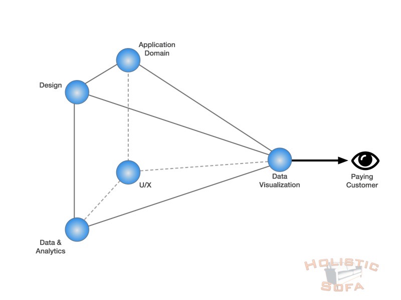
Data visualization is the corner closest to the user for communicating insights.
Unfortunately, many organizations do not have the balanced foundation (or coordination between spheres) to support visualization development, and simply adding a visualization person or team into the mix fails to provide the desired results. It’s worth taking a look at each of these foundational related spheres and considering how they relate to (or contrast with) data visualization.
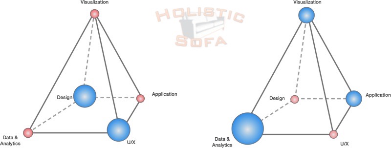
Examples of unbalanced Data Visualization Pyramids.
- User Experience: The best data visualization systems work seamlessly within the overall user experience. Many of the principles used for designing an users experience (such as layered understanding of Strategy, Scope, Structure, Skeleton and Surface) are useful for the design of data visualizations. However data visualization for non-trivial applications often introduces significant algorithmic complexities that are well beyond the scope of traditional UX designers. The classic example is for graph/network visualization. What can start out as a fun exercise in laying out circles with connecting lines can very quickly turn into some of the most challenging NP-Hard computational problems known to computer science.
- (Graphic) Design: Design is an essential component to any mature visualization system. The days when simple red/yellow/green color palettes and thick black frame borders were acceptable are long gone. Good design principles are needed both to satisfy the need for pleasing esthetics and to ensure the effectiveness of the system. A central component of that is in the selection of colors to ensure perceptual seperability; other critical areas include overall layout and effective typography. In many organizations graphic design is a separate process near the end of the creation process, however I consider some foundational knowledge of design principles to be an essential component that the visualization designer should incorporate at the outset.
- Data/Analytics: It is a truism that data visualization is useless without data. What is less obvious however is the relation between the data and the visualization. In some organizations the data and visualization are addressed by completely disjoint divisions: the data modelling team controls the tables, decides what to make available and ships it off for processing by the visualization or report writing team. The reality is more complex however: designing data visualization (including the user experience) involves discovering important facets of information that need to be shown to the viewer, and these facets in turn should drive the way in which data is collected, stored and disseminated. Analytics blurs the boundaries even further; many visualization techniques are tightly oriented around analytic algorithm such as multi-dimensional reduction, clustering and regression analysis. In an ideal scenario your visualization experts will be able to understand (or at least relate) to the complexities of data access and analytics.
- Domain Expertise: In many cases it is critically important that the visualization system be tuned to the specific domain requirements of the customer. This requires an ability to listen to (and tease out from) the customer/organization what the key questions are that they are trying to answer with data visualization. It also requires an ability for the visualization designer and organization to rapidly iterate and converge on the design. Generic visualization systems will often fail to truly capture the domain needs, and the domain considerations should be “baked in” to the visualization design at an early stage to ensure the final product is relevant to your customers.
Bringing it all together.
The one line question that started this article off:
“How can I find the right talent to hire for our data visualization needs?”
I still don’t have a one line answer, but I do have a few rules of thumb:
- Look for people who are strong in two or more corners of the Data Visualization Pyramid, it will facilitate interaction and understanding between the spheres.
- Avoid narrow specialists who only know a narrow subset of one sphere unless you know that you have a strong team in place that can work effectively to bring him or her on board.
- Diverse but overlapping team skill sets are invaluable, seek them out.
- Avoid linear stovepiping of your development that places your visualization design at some fixed point in the process.
- Use the data visualization design process to focus a strong and coordinated relation to the user or customer across your related technology spheres.